In the hustle and bustle of modern cities, where traffic congestion and pollution have become everyday challenges, metro systems have emerged as a game-changer in urban transportation. A city’s metro map serves as more than just a navigational tool—it’s the backbone of a city’s mobility, connecting millions of people and enabling a smooth, efficient flow of urban life.
The Metro Map: An Essential Urban Navigation Tool
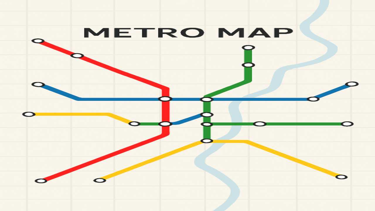
A metro map, at its core, is a schematic representation of a city’s metro system. It outlines the different subway, light rail, and rapid transit routes, typically with lines color-coded to differentiate each route. These maps are designed for clarity, not geographical accuracy, allowing passengers to easily understand the system’s layout.
Why Are Metro Maps Important?
- Easy Navigation
Metro maps help users navigate large, complex cities with ease. Whether you’re a daily commuter or a tourist, these maps simplify the maze of underground, elevated, or surface-level trains, making it easier to figure out the best route to your destination. - Promoting Sustainable Travel
Metro systems offer a sustainable alternative to cars, contributing to reduced air pollution, decreased traffic congestion, and less dependence on fossil fuels. In a time when environmental concerns are paramount, metro systems are often a key part of city plans for sustainability. - Efficiency and Speed
Metro systems are often the fastest mode of transport in densely populated cities. By avoiding the traffic of surface roads, metros can provide a quicker alternative, especially during rush hours.
The Art and Science Behind Metro Maps
Designing a metro map isn’t as simple as drawing lines between stations. Several factors come into play to ensure the map is both functional and user-friendly. Some key design principles include:
- Simplicity over Geography
Metro maps don’t strive to represent a city’s true geography. Instead, they aim for a simplified, abstract layout. Lines are often drawn straight, even if the real routes are curvy or indirect, to make the map easier to read. - Color-Coding for Clarity
Each metro line is typically assigned a distinct color, making it easy to identify routes at a glance. This color-coding system not only helps passengers differentiate between lines but also enhances the overall aesthetic of the map. - Strategic Station Placement
Stations are represented as dots or circles, and their positions on the map are spaced in such a way that their relative distance remains consistent. For example, two stations that are geographically far apart may be placed relatively close together on the map, depending on the specific route.
Notable Examples of Metro Maps
- London Underground
The London Tube map, designed by Harry Beck in 1931, is one of the most iconic metro maps in the world. Beck’s radical approach to simplifying the layout of London’s vast underground network has been hugely influential in the design of metro maps across the globe. His abstract, non-geographic design has become the gold standard for urban transit systems. - New York City Subway
With over 472 stations and 24 lines, New York’s subway system is one of the largest and busiest in the world. Its map, which was first introduced in 1979, was designed by Michael Hertz Associates and has since undergone numerous revisions. While it’s geographically more accurate than some other metro maps, it’s still an abstraction—this helps passengers make sense of the complex network. - Tokyo Metro
Tokyo’s metro map is a marvel of efficiency, with over 13 lines spanning the city. The map includes both the Tokyo Metro and Toei Subway lines, and while it’s one of the most complex metro systems in the world, its well-thought-out design allows commuters to navigate it with relative ease. Tokyo’s metro map also highlights the various interconnections with the Japan Rail (JR) system, making it an essential tool for anyone traveling in and around the city. - Paris Metro
The Paris Metro map, introduced in 1900, has a design that’s simple but also a little more geographically accurate than some other city metro systems. Its dense network of lines crisscrosses the city and has been continuously updated to meet the needs of the city’s growing population. Paris’s iconic ‘M’ logo can be spotted across the metro system, creating a sense of uniformity and branding.
The Future of Metro Maps: Digital Innovations
In today’s tech-driven world, the classic paper metro map is evolving. Digital and interactive maps are becoming increasingly popular, offering real-time updates, route planning, and even crowd density information. Apps like Google Maps, Citymapper, and local metro apps provide up-to-the-minute details on train schedules, delays, and optimal travel routes, further enhancing the commuter experience.
In some cities, there are even virtual reality (VR) systems that allow users to explore the metro system in 3D before their journey. These innovations provide greater flexibility and real-time information, improving accessibility and convenience for users.
Conclusion: The Heartbeat of Urban Mobility
Metro maps, despite their simplicity, are a crucial part of urban mobility. They bridge the gap between geographical complexity and human convenience, making vast urban spaces navigable for millions of commuters. The evolution of metro maps—from paper schematics to interactive digital interfaces—shows how transportation systems are evolving to meet the demands of modern life.
Whether you’re riding through the ancient tunnels of London, the neon-lit corridors of Tokyo, or the historic heart of Paris, the metro map is your guide to a smoother, more efficient, and sustainable journey. As cities continue to grow, metro systems will only become more important, making the role of these maps even more vital in the years to come.